Friday, May 13, 2016

Masking Exercise

By taking several images in sequence, you can layer them in Photoshop to create a photo like the one above.

Above, I took 5 shots in a row as the girl walked across the frame. Although I held the camera as still as possible, I was not using a tripod, so I had to align the images before masking.

  1. Shoot several images in a row with the same framing, having a subject move throughout the frame
  2. Open each file in Photoshop. Start with one image, then Select > All, and Copy > Paste each image on top of that initial photo, creating a stack of layers like you see above.
  3. Unlock the background image by double clicking on it, then hitting "OK" when you see the window pop up labeling it now "Layer 0".
  4. Highlight all the layers by shift clicking them.
  5. Go to Edit > Auto Align Layers. Click OK for the "auto" version.
  6. Now that the images are aligned, you can begin to mask. Add a mask to all the layers except the bottom one. Invert each mask to make it black.
  7. Using a soft white brush, paint on the mask over the area where the girl stood in each frame.
  8. Crop if necessary

Monday, May 9, 2016

Putting Images Online

Standard Image Size for web:
-No longer than 1000px on any side

Resize Images for Web Using Scripts:

To quickly and easily change a whole folder of hi-res photos into web-size JPGs use Scripts.

File > Scripts > Image Processor:
 Select the folder you want to convert. Choose your hi-res Master files (psd/tiff/hi-res jpg, etc). It will make duplicates of everything so don't worry about "hurting" your Master files. A new folder called "JPEG" will be stored in your original Master files folder when you choose "save in same location".


*****

Embedding Copyright, Naming Files & Watermarking:

File naming: Using Bridge, you can rename all your files to be consistent and have your name in them, for example, gleeson_web_01.jpg, gleeson_web_02.jpg, gleeson_web_03.jpg...
*I like to name my files with "web" or "Print" in the title so I know which size each JPG is and don't accidentally print a web size image. In Bridge TOOLS > BATCH RENAME (be sure to have the images you want to rename highlighted for it to work).

Copyright: In Bridge, you can create a new Metadata template with all your info in it. Go to TOOLS > CREATE METADATA TEMPLATE. Then in the future, you can apply this to any image you want by going to TOOL > REPLACE METADATA.


Creating an Online Portfolio:

If you don't have a website, you may think about trying this free online portfolio service called Carbon Made: http://carbonmade.com. Here's an examples of a portfolios by a former students of mine: http://hanspurwa.carbonmade.com/ 

Another option that connects to Flickr is http://pullfolio.com

I use Photo Biz, photobiz.com, for my website www.eringleeson.com. It's a drag and drop template for people like me who don't know HTML and web design. Super user friendly, and is about $15/month.

Some free blog formats that are available are Blogger (via gmail), Wordpress (highly customizable templates), Tumblr (built in social media). Each of these offer templates you can buy.

For example, my website/blog The Forest Feast is a Tumblr blog. Although my template is not as customizable as a Wordpress template might be, I wanted to built in social media aspect to attract followers and drive traffic. I bought a $75 template from Pixel Union, and because I wanted something more memorable than forestfeast.tumblr.com, I went to Go Daddy and bought the domain name www.theforestfeast.com and had the 2 connected, for approx $15/year.

Wednesday, May 4, 2016

Sharpening

Sometimes if you focus is a little off and you want to sharpen an image, you can do it easily as follows:

1.) Duplicate the background and call this new layer "sharpening"
2.) Go to FILTER > SHARPEN > UNSHARP MASK

3.) Adjust the Amount  &  Radius (radius usually no higher than 3). These numbers depend on file size.  Eye-ball it then click the preview box on and off to see how it looks.


4.) When you're done, hit OK and you can always decrease the layer opacity if it's too strong. Alternatively, you can make a mask, invert it and paint white just over the areas you want sharper (like the eyes of a portrait for example.)

Wednesday, April 20, 2016

Adjustment Layers

Here's a great intro video: link here.

But basically, think of an adjustment layer as a filter you lay over your image. But you can make this filter affect only certain parts of your image by painting on the mask. You can use adjustment layers to alter your images without making permanent change. That is, you can go back later and "turn off" the change if you want.

The main advantage of the adjustment layer is that it automatically comes with a mask. This means you can add the change (or "filter") just to a certain part of the image, instead of the whole image. You do this by painting with either black or white. See this curves demo to understand what I mean.

*rule of thumb with masking: White reveals the change and Black conceals the change.

CURVES:

You can use a Curves adjustment layer to brighten (dodge) or darken (burn) selective areas of an image.

For example, in the image below, I added one Dodge layer to brighten select areas. The result is an image that looks more dynamic and less flat:
In your adjustments palette, choose the Curves icon. Drag from the middle up for brightening, or down for darkening:
This automatically makes a mask for you. Invert the mask (command i) and then paint with a WHITE SOFT BRUSH on the mask, just on the areas where you want to see the change.


Remember, on a mask: White reveals, Black conceals. Above, I have painted with white JUST where I want the change to show through.

HUE SATURATION:
(to boost individual colors)
In the image below of the pomegranates, I used a hie saturation adjustment layer to isolate and boost just the reddish tones in the picture by moving the "saturation" slider to the right:
(Be sure to choose "reds" instead of "RGB" in the menu I've circled here -->)


This is what the adjustment layer looks like on your layers palette:

Because the adjustment layer's mask is white, the change is visible.
Remember, WHITE REVEALS, BLACK CONCEALS.

Similarly, you can reduce the red by moving the slider to the left.

Friday, April 15, 2016

Night Photography

Suggested Homework Due May 6th: Shoot a series of images outdoors at night. Here are some past student assignment examples: Below is a selection of images shot by students for the Night Landscape assignment.  Some fun things to try:

  • Try using a High ISO (as high as your camera will go) and no tripod (remember to keep your shutterspeed at 60 or above so it's not blurry). This will create a lot of graininess.
  • Try using a tripod and a lower ISO (like 200 or 400), but a very long exposure (perhaps a couple seconds).
  • Try having some motion in the shot for a long exposure (like this flashlight motion around the tree, below)
  • Try a long exposure combined with a flash (perhaps having the flash light up a person in the dark while the long exposure shows detail in the dark background). Try having the person run through the frame and the flash will "freeze" them.

Long exposure shows motion. Photo by Joel Stuckey
These 2 photos by Gary Prideaux perfectly illustrate the difference between a long exposure night shot and a high ISO night shot. A high ISO often produces graininess, but doesn't require a tripod:
Short Exposure, High ISO- grainy! Photo by Gary Prideaux

Long Exposure, low ISO, more clarity. Photo by Gary Prideaux
This long exposure shot by Mira Zaslove shows some motion on the water,
but the architecture is crisp since she used a tripod.
Here are a couple fun photos by Michelle Nguyen in our class using a long exposure, tripod and a flashlight:


The 2 photos below are by Chuck Thompson, taken in Palo Alto at Bowden Park. His Shutter Speed was 1/5 sec (which allowed for the motion of the cars). The aperture was f/8.0. The ISO was 1600, which is somewhat high and added a bit of graininess in the darker areas like the tree trunk and the roof of the train station.

Graininess is common in night photos (because of the high ISO). If you want to avoid graininess you can use a lower ISO (like 400) and a longer exposure (maybe like a half second, with a tripod), and perhaps a lower number F-stop (wider aperture), something like F 2.8.


Wednesday, April 6, 2016

Portrait Retouching


PORTRAITURE


Portraiture can mean many things. Environmental portraits of people show someone's surroundings and close up portraits can be more about a personal's expression or emotion. Stories are told in different ways.
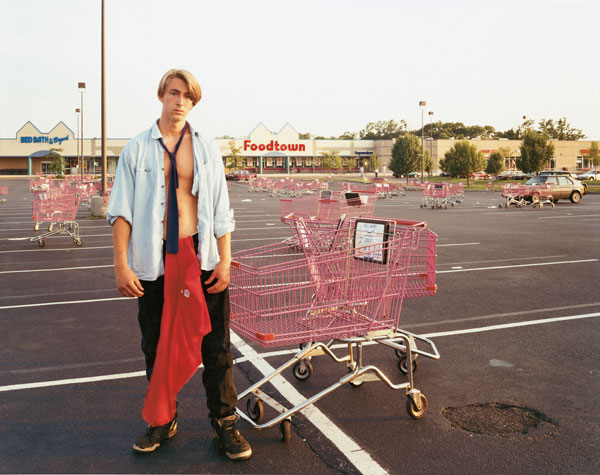
environmental portrait by Joel Sternfeld
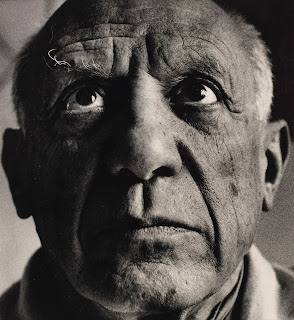
close-up portrait of Picasso by Richard Avedon (notice the side lighting)


Lens Choice:
Lens Length Impacts Portraiture!
In taking pictures of people choosing a longer lens (like above 50mm) is generally more flattering. Try standing farther away from your subject and zooming in if you have a zoom lens.
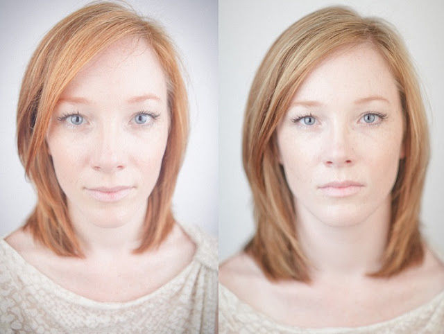
Image on left is a wide angle (like a 18mm lens). Image on right is a longer lens (like 85mm) Image credit here.
My favorite lens for portraits is the 50mm f1.8. You can find it at B&H here. You generally want to use a 50mm or longer lens when shooting a portrait (I'd say 50-100mm. Some say 80mm is the best.)

It's not very wide, so you will want a zoom lens as well. The more expensive ones that go to f2.8 are the nicest and assure that blurry background. Something like one of these.

I also have a fixed 28mm f2.8 lens I love. They say prime lenses (those that don't zoom" are a bit sharper. This is a bit too wide for a portrait, but great for group shots.

PHOTOSHOP TOOLS for portrait retouching:


QUICK SUMMARY: Retouching a portrait:
Process the RAW file and open it in Photoshop.
-Layer 1 (bottom of stack) = Background
-Layer 2 = Background Duplicate (Duplicate the background, call it "retouching" or "patch and clone stamp". Fix skin here) You may also like to use the Healing Brush Tool for skin.
-Layer 3 (top of stack) = Curves "brighten layer" for brightening under eyes, whites of eyes, teeth, etc:


THE DETAILS: Basic Portrait Retouching **be sure to zoom in to 100% or 200%

We work from the bottom layer up. Each time you add a new layer, it should get added to the top of the layer stack. It's important to work in this order and add new layers to the top of the layers stack as you move along. 

1.) Retouching Layer/Blemishes: Duplicate background layer by dragging it down to the little icon at the bottom of the layers palette that looks like a page with the corner folded. This duplicate layer is where you should do your blemish and spot removal. Using a combination of the following tools, Clone Tool, Healing Brush Tool, Spot Healing Brush Tool, Patch Tool and filling with content aware to rid of all blemishes and stray hairs. Turn brush hardness all the way off, to 0% so that your brushes are soft. Experiment with the opacity of each tool as well.  (Clone & Healing brush tools also work on empty layers if you choose “sample all layers” from the bar at the top.)


2.) To Add Slimming (optional) : FILTER > LIQUIFY. Add this to the above retouching layer, or if you think you may want to "turn it off" later, do it on a separate layer by Duplicating the “retouching” layer and call it “Liquify”.  Liquify minimizes double chins, chubby cheeks, odd facial angles, crooked bangs,  bunched up clothing, etc. Set Brush Pressure and Brush density to “17”- this is a good starting point. Use a fairly large brush.


3.) Decreasing Wrinkles: Make a new empty layer (click icon at the bottom of the layers palette that looks like a page with the corner folded). Using the healing brush, option click a "good" source area and heal over the wrinkles. Or try the spot healing brush. Make sure "all layers" is selected from the drop down menu at the top (otherwise it won't work to heal on an empty layer). The advantage of healing on an empty layer is that it won't increase your files size too much. The advantage to working on wrinkles on a separate layer is that you can decrease the layer opacity without affecting other retouches.


4.) Decrease Redness: You may need to selectively decrease redness in certain parts of the face. To do this, make a new "Hue/Saturation" adjustment layer from your adjustments palette. Change "Master" to "Reds" and move the slider to the left on the Properties panel. Invert the mask that has been created for you on the layers palette (command i for a Mac/ control i -PC). Paint with a big, soft white brush (B) on the mask to reveal the change (and decrease reds in certain areas).

5.) Brightening with Curves. This is great for brightening under eyes, brightening shadow areas and adding highlights to hair. Make a new curves layer, push the curve slightly from the middle to the top left corner (see below), invert (command i) the mask and paint with a soft white brush on the areas you want to become brighter. You can always decrease the opacity of the layer if the effect is too strong.

6.) Teeth: you can take some yellow-ness out of teeth and brighten them up a little using a Hue Saturation layer. See step #4, except change "Master" to "Yellows". And move the "Lightness" slider to the right to make the teeth brighter. (*note: you can select the teeth first using the lasso tool, or you can simply paint over the teeth on the mask)

Here's an overview of the final layers palette incorporating all the steps I mentioned above:

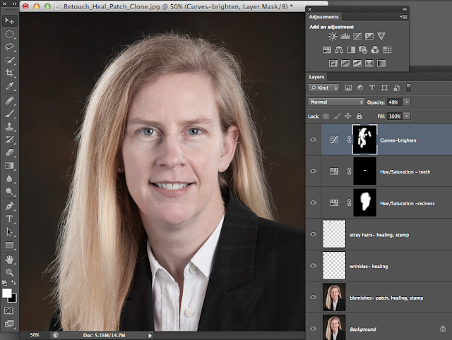
image source: Lynda.com 


WHEN DONE....Save as TIFF or PSD to maintain layers. Save another copy as a JPG to be able to email it, make a print, upload it, etc. The TIFF/PSD is your Master File and if you want to make any edits layer, you'll go back to the TIFF/PSD.


Portrait Exercise: Shooting with Window Light

Let's take a look at the differences in quality of light a simple window can offer. Window light looks different when coming from the side, behind or directly at your subject's face. Use of a fill card (reflector or white poster board) can alter the light dramatically and fill in shadows to reveal more detail.

 In Class Demo Exercise: Taking a Portrait with Window Lighting

1.) SIDE LIT: Take a photo with side lighting from a window. Take one with and without a fill card.   Try having the subject's face pointing toward  and then away from the light.

Examples of (what could be) window side-lit portraits:
by Annie Lebovitz
by Annie Lebovitz
 When shooting portraits, pay close attention to the direction the light is coming from and the quality of the shadows. Generally softer shadows are more flattering (i.e. shooting near a window with diffused light, or in the shade or on a foggy day).


2.) BACK LIT:
Try taking a picture with your subject's back to the window. Camera faces window. How does this affect your exposure settings and the light on the face?


3.) FRONT LIT:
Try taking a picture of someone where they are facing the camera and the light is hitting their face directly (window behind the photographer, subject looking out window)


*Note that the window we used did not have direct sun coming through it- the light was diffused so the shadows were softer.